A key part of the data analyst’s workflow is building dashboards and reports1. In my experience, there are three distinct approaches to developing these products: Storyteller, Impresario, and Guide2.
The Storyteller Approach
These dashboards and reports tell a compelling story based on insights gleaned from your analysis. This may take the form of answering questions posed to you from your clients3, or may be insights you’ve uncovered through your own exploration, modeling, and testing. You can certainly share these results in the form of a memo or a dense written report, but packaging them with effective visualizations and the right annotations and captions allow you to share your insights in a compelling and useful manner.
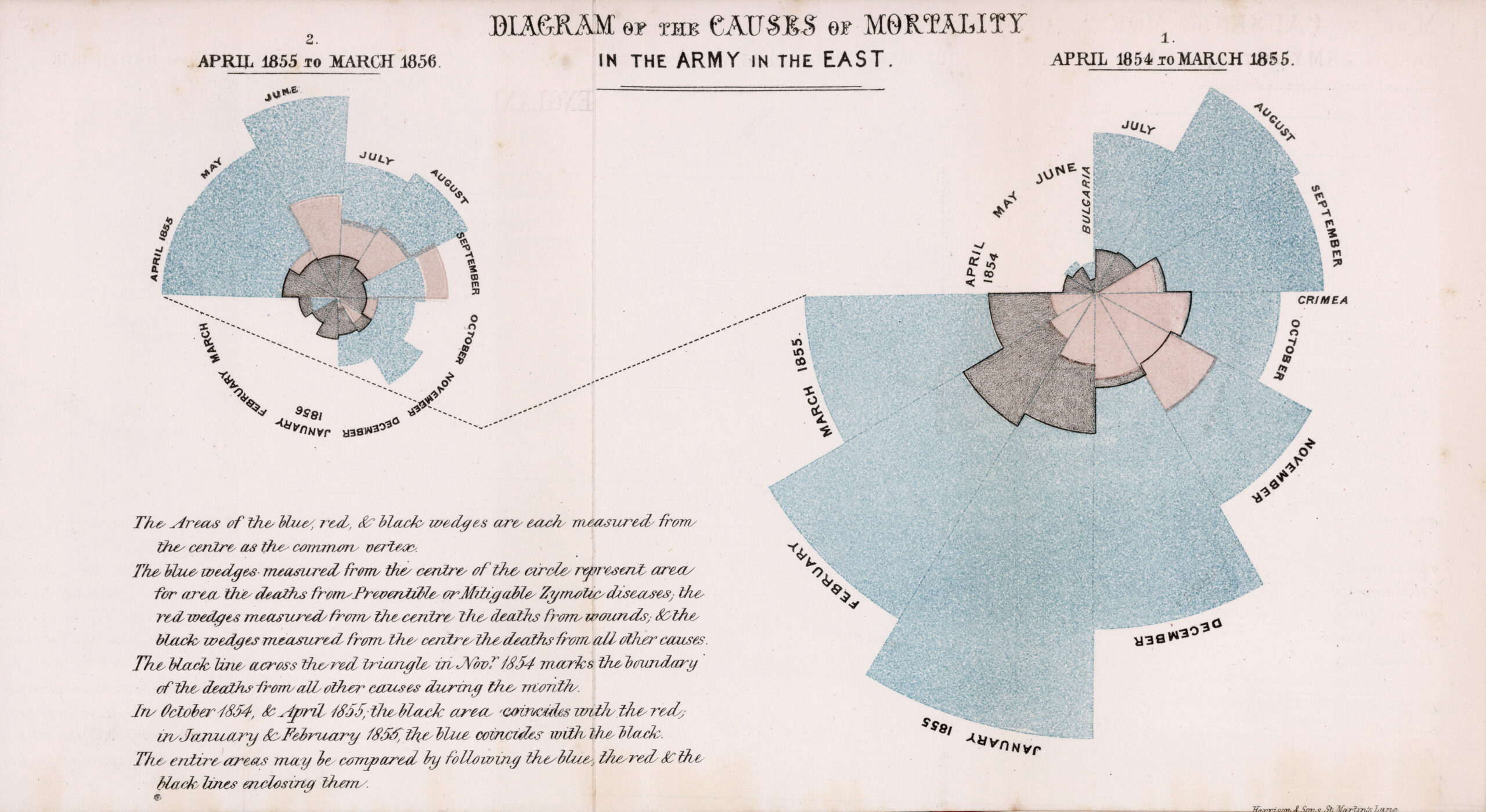
Humans are natural storytellers, and thinking of your reporting products as “telling a story” is a key part of delivering data analysis that can drive change. Choosing the correct graphics and charts guides the end user towards your conclusions while providing the necessary context. A prime example of this is Florence Nightingale’s mortality graph from over 160 years ago:
The Impresario Approach
A completely different approach is to assemble a report or dashboard that is “shiny”, flashy, and impressive whilst being mostly empty of anything substantive. The goal with this approach is typically to convince stakeholders to maintain an existing budget for an initiative by showing that it’s working, convince them to give a project or program more money, or simply to convince them that you and/or your team are amazing and valuable.
These reports and dashboards are almost always light on substance and big on flashy visuals, colorful graphics, and oversized metrics or numbers devoid of context. Subject matter experts will quickly dismiss these products as being overly simplistic and low-yield, and often they will see through the vapid emptiness to the ulterior motives underlying it.
That doesn’t mean this approach is entirely without merit. Some stakeholders don’t need or don’t want all the details. They want a simple report that they can quickly scan. Many EMS data analysts work in a system where key decisions, particularly funding ones, are made by elected officials and city leaders who are busy and not well-versed in EMS or medical terms or details. Similar situations exist in many corporate settings. Provided you are committed to delivering your simplified report in a way that does not mislead or obscure the underlying truth, this kind of approach can be very effective.
That said, the only way to avoid subject matter experts dismissing you as being simplistic and lacking substance is to provide them with the high-yield report or dashboard that goes along with the dumbed-down version. In many cases, this is also important because those same experts may be asked questions by the higher-level leaders that go into more detail than the simple report initially provided.
A great example of this kind of report is this tongue-in-cheek infographic from the webcomic Saturday Morning Breakfast Cereal.
The Guide Approach
This last approach really only works for interactive dashboards. In this approach, rather than simply telling stories with the data based on insights you’ve gleaned, you develop a product that enables your end users to do their own exploration in the source data. Your work shifts from giving an answer to guiding them through their own journey. These dashboards are replete with interactive filters, where perhaps clicking on a map region adjusts results across the rest of the dashboard, or selecting an item from a dropdown lets them drill down into a specific unit’s performance.
Developing these dashboards requires a solid understanding of what types of questions your end users may want to ask and how they want certain results calculated. Your work then revolves around implementing useful abstractions around the underlying data to make the datasets and datafields user friendly and building effective UI elements to guide them in their own exploration.
These kinds of dashboards take a lot more work to get right, but become highly useful tools for these leaders to guide their day-to-day operations and big-picture strategy, and go a long way towards enabling your organization to become more data-driven.
In my experience, there are two huge pitfalls to avoid when building a “Guide” dashboard. First, you want to ensure you understand how they will use data results operationally. This is critical to ensuring you are choosing the right data elements and displaying them in the right way. Second, you have to ensure that there is clarity on how key metrics are calculated. If you don’t take the time to achieve this level of understanding, you may end up showing one calculation while end users assume an entirely different calculation. A useful antidote is to include captions or a “definitions” page that clearly states what your calculations mean. Every industry has their own semi-standard metrics and KPIs (with terms like churn, retention, and utilization, but dig a little bit and you’ll find there are often many different ways to calculate something with the same exact title4.
Choosing Your Approach
At the end of the day, which approach you take is going to be driven by what your end users want or what you believe they will benefit from.
Want to convince busy senior leaders that a program is working well? Consider the Impresario approach, while being careful to stay true to the underlying data and not mislead. Here, the real work is in simplifying as much as possible while still leaving the core message intact; maximizing the impact of each element in the report and ensuring the design and aesthetics support your end goal.
Want to share actionable insights with stakeholders while providing lots of additional context? You should be telling a story. The real work here is determing how to frame your story, what context matters, and how much detail your audience will want to see (or ought to see).
Want to provide a tool for data discovery, not just a static report? You’re in the guide business. The real work here is spent understanding your clients’ desires for the tool, how they will work with it, and how they will use the results operationally. And then spending the time refining the tool to work effectively for them and providing hands-on training so they can get the most benefit from it.
Finally, each approach works best when you borrow ideas from the other approaches. You should always strive to provide appropriate context and work towards telling a story—whether in a super-simple report or in a dashboard tool. Your reports and dashboards will always be more compelling and have better engagement when they look good, use design elements to achieve clarity, and remove unnecessary elements. And your visuals should always invite your audience to do their own exploration and digging.