Capturing this for my own future reference—and in case anyone else wants to create better histograms.
The default ggplot histogram is functional but boring. Here’s a histogram showing the number of words in a set of movie reviews1.
review_stats |> ggplot(aes(review_words)) + geom_histogram()
Functional? yes. And yet also really pretty ugly.
I decided to do better and assemble a function that extends ggplot with an opinionated, better histogram.
review_stats |> better_hist(aes_x = review_words,
                           label_args = list(title = "Word Counts of Reviews",
                                             subtitle = "Movie Reviews from NLP lab at Cornell",
                                             x = "Word Count",
                                             y = "Number of Reviews"),
                           add_mean = TRUE,
                           add_sd = 2)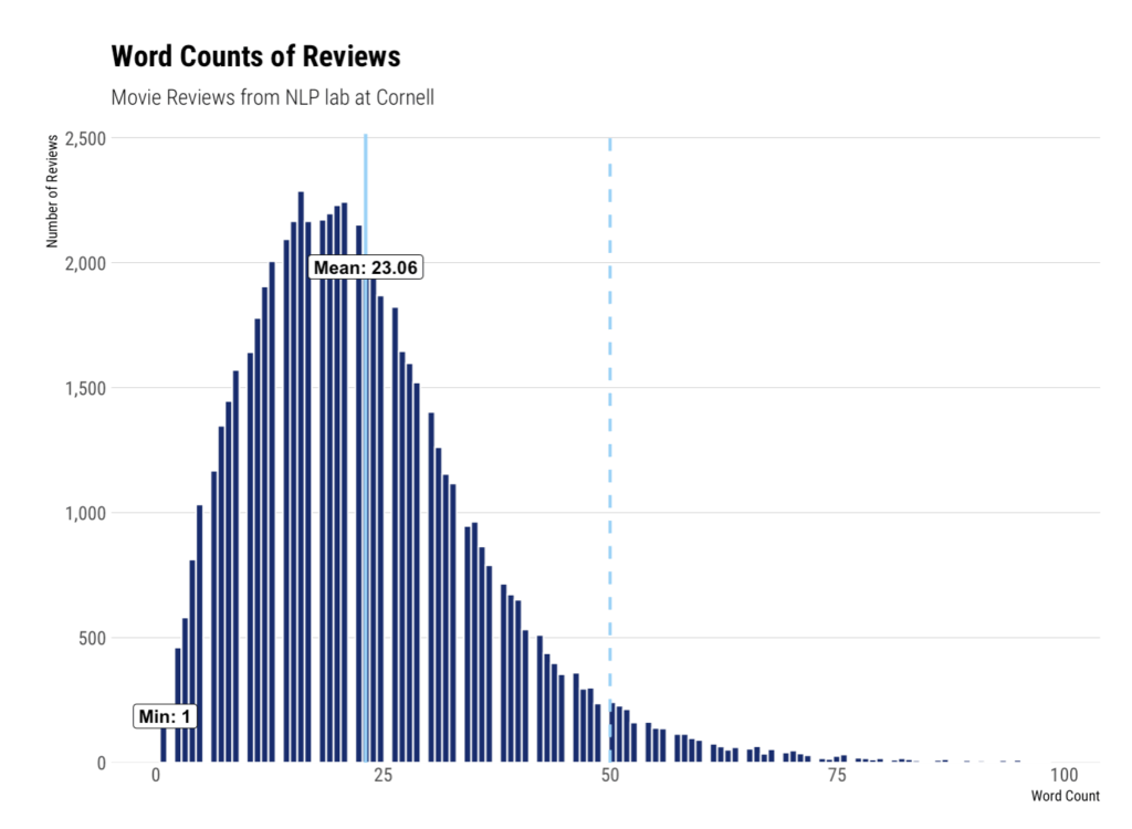
The full code is in a GitHub gist here.
Functionally, this function starts by calculating binwidth using the Freedman-Diaconis method. It can also (optionally) calculate density. We add labels for minimum, maximum, and mean, then style using the hrbrthemes theme_ipsum_rc. Lines for mean and standard deviations can aso be set.
Creating functions for this kind of work is immensely useful as it enables you to generate rich graphics with a consistent set of styling easily. This is the ideal sort of thing to include in a personal R package.
- Movie Review Data from Cornell: https://www.cs.cornell.edu/people/pabo/movie-review-data/ ↩︎